Sheet 03 of 04 · Esc
a website with one job — turn a tournament organiser or a brand’s event manager into a booking enquiry
lucif3r
A booking site that feels like a live broadcast — kept current by the talent, not a developer.
Architecture of lucif3r: Control Room (Payload CMS) to PostgreSQL (stores content); Control Room (Payload CMS) to Live pages (publish); PostgreSQL to Live pages (serves).
Architecture, drawn 1:1
Problem
Generic talent sites and link-in-bio pages don’t sell a broadcaster, and the site needed to turn organisers, brand managers and sponsors into booking enquiries, with content the talent could keep current without a developer for each new event.
What I built
- A broadcast-style design system — near-black ground, one magenta accent, gold for highlights, square corners by rule, and a film-grain texture layer.
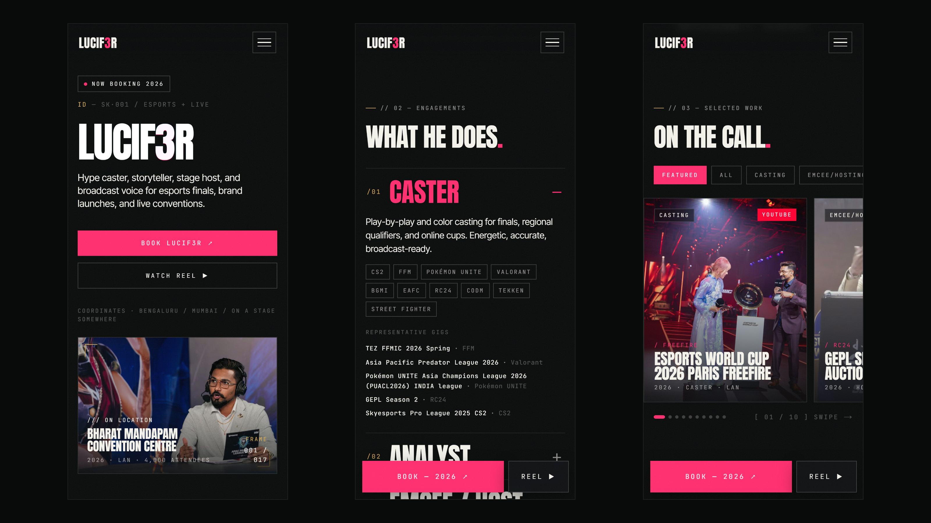
- Motion with a reduced-motion off switch: a glitching wordmark, a gold shimmer, a ticker, and smoothed scrolling.
- A home page built around one path to the booking form, with a bento grid of past events and a gallery from the stage.
- A custom Control Room on top of embedded Payload CMS, with live preview, draft/publish, and even the brand colours editable.
Key decisions
- Kept all effects to plain CSS plus one small scrolling library, so nothing heavy has to download before the page comes alive.
- Gave mobile its own layout rather than a squeezed desktop one, because a booking often starts with a link opened on a phone.
- Settled the look through two HTML prototypes rather than debating directions, and removed a layered custom cursor once the grain layer supplied the same depth.
- Validated the booking form in the browser and again on the server against the same rules, and used Cloudflare Turnstile to keep bots out.
- Kept analytics and Speed Insights on the public site only, never inside the Control Room.
Outcome
A site that looks like the job: broadcast energy from the first frame, proof of the stages already worked, and a booking form at the end of every path. It stays current because the talent keeps it current — new events, new photos, even new colours — without waiting on anyone.
Esports Talent Portfolio — Broadcast-Style Motion & a Custom Control Room
lucif3r is an esports caster, stage host and broadcast voice working across esports finals, brand launches and live conventions. The brief was a website with one job — turn a tournament organiser or a brand's event manager into a booking enquiry. What shipped looks like the broadcasts it sells, and comes with a control room the talent runs without calling a developer.
It is a very different brief from the business platforms elsewhere in this portfolio. There, the hard part is permissions and workflow. Here, the design is the product.
The problem
Most talent sites are a link-in-bio page, or a template with the name swapped in. Neither sells a broadcaster. The people who book a caster want to feel the energy before they hear the voice, see the calibre of events already worked, and ask about a date without hunting for a contact.
The audience was written down before anything was designed: tournament organisers and esports organisations first, then brand and event managers, then sponsors. Fans are welcome, but the site is not built for them. Success is measured in qualified enquiries, not pageviews.
And the content never sits still. Every month brings a new final, a new partner, new photos from the stage. A site that needs a developer for each of those is out of date by the next event.
What was built
An identity that reads like a broadcast
The design system is a stage under lights: a near-black ground, warm off-white type, one magenta accent, and gold kept for numbers and highlights. Display type is Anton in tall uppercase, body copy is Inter Tight, and the small broadcast-style labels are JetBrains Mono. Corners are square everywhere, by rule. A fixed film-grain layer sits over the whole page and gives the dark surfaces texture without a single extra image.
Type scales fluidly with the screen instead of jumping between breakpoints, and the layout keeps working past the usual desktop width — on very wide screens it gets denser rather than floating in empty margins.
Motion, with an off switch
- The wordmark glitches like a signal dropping in and out: an RGB split in magenta and cyan, a short burst every four seconds, faster under the cursor. Cyan appears nowhere else on the site, so the effect stays special.
- A gold shimmer sweeps across the name, a ticker runs beneath the hero, and a pulsing dot marks the booking status.
- Hover states reward exploring: event photos push in, partner logos warm from greyscale into colour, and gallery captions rise into view.
- Scrolling is smoothed, so the page glides from section to section.
The effects are plain CSS, with one small library for smooth scrolling, so there is nothing heavy to download before the page comes alive. Visitors who ask their device to reduce motion get a calmer site: smooth scrolling never starts, the glitch resolves to clean type, and movement gives way to simple fades.
Built around the booking
The home page is one path, not a menu: who the talent is, what can be booked — casting, analysis, hosting — the proof, and the form. The proof is a bento grid of past events with filter tabs that open on a hand-picked Featured view, a wall of partner brands, and a gallery from the stage.
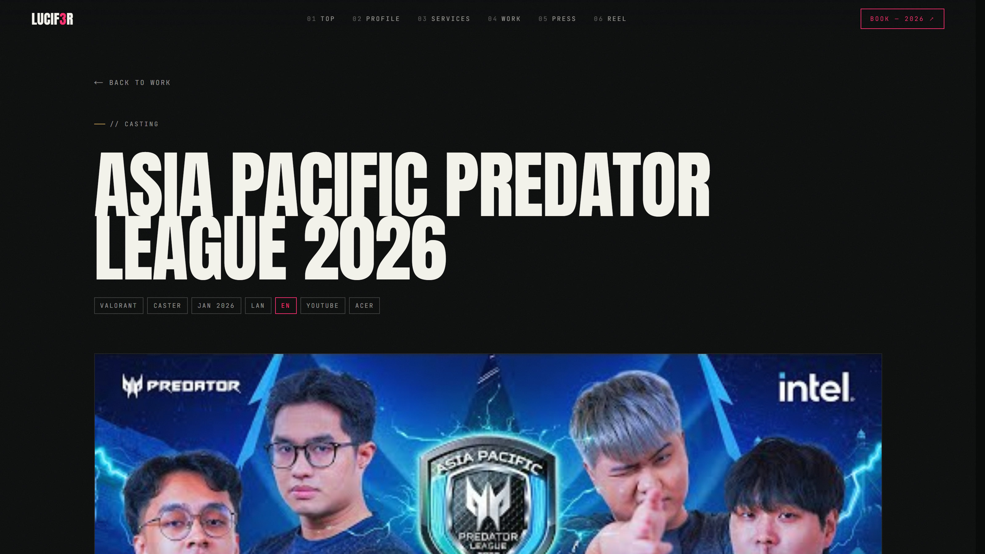
The biggest events open into their own pages with the event details and the broadcast video, which loads only when someone presses play, so the page still opens quickly.
The booking form checks every field in the browser and again on the server against the same rules, keeps bots out with Cloudflare Turnstile, and delivers each enquiry by email from the site's own domain. Hit reply, and the answer goes straight to the person who asked.
Mobile is its own layout
A booking often starts with a link opened on a phone, so mobile got its own layout rather than a squeezed desktop. Services fold into an accordion. The event grid becomes a swipeable carousel. A full-screen menu takes over navigation. And once a visitor is deep in the page, a slim bar slides up with the booking button — then gets out of the way when the form itself is on screen.
A control room the talent runs
Every word, photo, event and partner lives in Payload CMS, embedded in the same Next.js application. On top of it sits a custom Control Room, built for someone with no interest in learning a CMS:
- Every section of the site — hero, stats, ticker, about, services, work, partners, gallery, booking, footer — is edited in one place.
- Changes appear in a live preview of the real site before anyone else sees them.
- Drafts are kept apart from what is live: publish when ready, or revert.
- Photos are uploaded to a shared media library.
- Events can be added, reordered, featured or removed.
- Even the brand colours are editable, and flow through the whole design.
Publishing refreshes the live pages straight away. There is no rebuild to wait for and no developer to ask.
How it was built
One Next.js 16 and React 19 application holds the public site, the Control Room and the CMS: one codebase, one deployment, nothing to keep in sync. PostgreSQL on Neon stores the content, Vercel Blob the photos and Resend the email. It all runs on Vercel under a custom domain, with database migrations applied as part of each production release and preview deployments for work in progress.
Styling is Tailwind CSS v4, with the brand's colours and type defined once as design tokens. Pages are served static, images are resized and delivered in modern formats, and search engines get structured data describing the talent and each event, plus a sitemap. Privacy-friendly analytics and Vercel Speed Insights show how people use the site and how quickly it loads for them — on the public site only, never inside the Control Room.
Unit tests (Vitest) guard the logic that is easy to break quietly: form validation, the bot check, the bento layout pattern, the theme colours. End-to-end tests (Playwright) walk through the booking flow, the Control Room and the responsive layouts in a real browser.
Built with AI, end to end
A written brief before any code. Audience, conversion path, information architecture and every home-page section were agreed in a design document first. The story the page tells, top to bottom, got a document of its own.
Directions prototyped, not debated. The current look was settled through two HTML prototypes, so the decision was made on something you could scroll. The chosen direction also removed things: a layered custom cursor went, and the grain layer now supplies the depth.
A spec for every major change. Moving the content into a CMS, the responsive redesign, the Control Room and the Featured view each started as a written spec and an implementation plan.
The right model for each job. Planning and code review go to the strongest models; routine implementation goes to fast, cheaper ones.
A map of the codebase. Early in the build, a knowledge graph mapped the code — files, functions and how they connect — so the reach of a change could be checked before it was made.
I wrote the brief, made the design calls, and reviewed every screen and every step between a visitor and a booking. I am accountable for what shipped. AI made me faster and more consistent. It did not work unsupervised.
The result
A site that looks like the job: broadcast energy from the first frame, proof of the stages already worked, and a booking form at the end of every path. It stays current because the talent keeps it current — new events, new photos, even new colours — without waiting on anyone.
Building something similar?
If you are a creator, host, athlete, studio or event brand, and your website should feel like the work itself and stay current without a developer, get in touch and tell me what yours needs to do.